Here are some common traps that can make websites frustrating for users and less effective for your clients – here's seven ways on how to avoid them.
Light grey text on a white background
A design trend that many regard as unfortunate has taken hold in recent years: the use of light grey text on a white background. Sometimes the lack of colour contrast even gets paired with a tiny typeface, making the resulting copy uncomfortable to read even for people with good eyesight, and totally inaccessible for those with any level of visual impairment, which is quite a lot of people.
The thinking behind grey text rather than black is that too much colour contrast can cause eye strain. This is true, but it’s important to make sure you’re striking the right balance between the visual assault of black-on-white versus ghostly text that fades into the mist. The first thing to know is that the W3C Accessibility Guidelines state that you need a minimum contrast of 4.5:1 for most text, so making sure you hit that is a good starting point.
Lea Verou’s Contrast Ratio tool is good for getting the mathematical information about your colours, and there’s also some sample text so you can see how it looks. It will accept colours in any format: words, hsla or hex values, and it tells you whether you’re compliant with the accessibility guidelines.
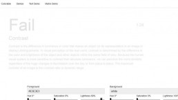
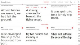
Colorable (pictured above) is a good option for judging by eye, and it has sliders so you can tweak things until it’s just right. Remember that testing text colours on different devices and lighting situations is important – what’s readable on your high-end screen might look very different on another device. Even if you’ve hit the minimum contrast ratio for accessibility, there are other factors that affect how text actually appears to the end user – so testing is the only way to make sure you’ve got it right.
Modals
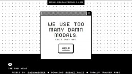
Modals are a user experience horror that have taken over the web in recent years, adding the administrative chore of closing an intrusive pop-over to the process of visiting many websites. It’s particularly bad on mobile, and can make your site extremely frustrating or totally inaccessible to those using assistive technologies. MODALZ MODALZ MODALZ by designer Adrian Egger provides advice on alternative options for those moments when the urge to use a modal strikes.
“Modals are the crutch of the inarticulate designer and developer,” he writes. Instead of a modal, he suggests that you could use an expanding element, a non-modal dialog, or it might be more appropriate to use a new page. If you can’t resist, or someone else is insisting on modal-usage, he’s got some pointers for making them as tolerable as possible, and some particular pitfalls to avoid.
Not optimising images
Large images are one of the biggest sources of unnecessary page weight, and optimising them is one of the easiest things you can do to improve your site’s performance.
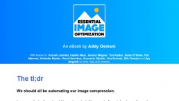
Addy Osmani’s free ebook, Essential Image Optimization, is an excellent resource for learning about how to do this. If you don’t have time to read the whole thing, he has a handy ‘the tl;dr’ at the top that points you towards resources for automated image compression, which he recommends, and other efficient tools if you’re not going to automate.
Responsive Issues Community Group (RICG) chair Mat Marquis’ book Image Performance is also a great read on this topic, and also check out our 4 essential image optimisation tips.
Not prioritising performance
The statistics on this vary, but the overall picture is that if your website takes more than a few seconds to load, people start leaving in droves. According to this article, most people will choose to browse fast sites that are irrelevant to what they’re looking for than a slow site that contains the information they want. And of course, this intolerance for slowness has a massive impact on conversions. According to these numbers, slowing load time from 2.4 to 3.3 seconds can lose you a quarter of your conversions.
With this in mind, it’s clear that speed has to be a top priority if you want to create a good user experience and maximise your conversion rates. Here are some great resources to help you out:
Performance Email
This newsletter is great for staying up-to-date with all the most useful performance-related tools and information.
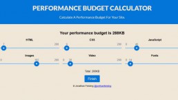
Performance Budget Calculator
Decide how fast you want your site to load on which kind of connection and this calculator tells you how much page weight you can spend on each resource. There are sliders so you can adjust the allocation between CSS, images, fonts and so on.
Browser Calories
Check out your competitors’ sites with this browser extension that compiles a report on the page resources of any site you visit, comparing them to the weights of the web’s top 100 sites.
Smashing Magazine’s Front end Performance Checklist
As well as the checklist, this article is packed with a huge selection of performance resources and general guidance on getting started with optimising your site.
Also read our post with four tips to improving your page’s performance.
Using a big framework you don't need
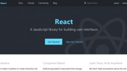
If you’ve put in the time to learn a big framework such as React or Angular it can be tempting to use it for all your projects, but laying down reams of boilerplate code and introducing complex technology and a bunch of dependencies for a simple site that doesn’t need it usually isn’t wise. Why bloat things up when a static site would be faster and leaner?
Chris Coyier has written up his take on the situation here, where he discusses the good and not-so-good reasons for using a framework.
Sometimes, writing things from scratch can be the right call even for more complex projects as it gives you more control and you end up with a leaner code base and fewer dependencies. This article explains why the team behind MeetSpace decided to build without a framework.
Small body text
There are many reasons why we tend to design with text that is smaller than the ideal: pressure to fit a lot of content on the first screen of a page; a perception that larger text somehow appears less sophisticated; and the default font sizes in the big frameworks, to name just a few.
In his post Your Body Text is Too Small Christian Miller explains the many benefits of using larger text – it improves readability, it works better from a distance (maybe your site is being viewed on a smart TV) and it improves visual impact and usability. Another interesting side-effect of using bigger type is that it improves copywriting because it encourages you to use fewer words.
The ideal font size for your website is probably larger than you think, and Miller has some great advice on how to design with bigger text in mind.
Not prioritising the user

A sure-fire way to end up with a terrible website is to prioritise what a client wants to say over what a user wants to know. The entries below from The Oatmeal and xkcd may be old, but they still do a great job of articulating a phenomenon that persists to this day – a complete failure to consider why someone is visiting your website.
In the Oatmeal piece, the author lists the things most people want when they go to a restaurant site, such as a menu, address with link to a Google Map, and opening hours. Then he presents a site that demonstrates what we often get: images or animations you don’t care about, text about ‘ambience’ or the ethos or history of the place, the menu as a downloadable PDF, and pertinent information hidden away.
The xkcd cartoon does the same thing for university websites: people want course lists, contact information and application forms, but they get a photo slideshow, a letter from the president and the institution’s mission statement.
The way to avoid this is to do user research and testing, even if it’s just an informal conversation with a sample of users. Find out the main reasons someone visits your site, the main tasks they want to achieve, and prioritise those. Our tips for better user testing will get you started.